Ridgeline chart
We need to load the following packages:
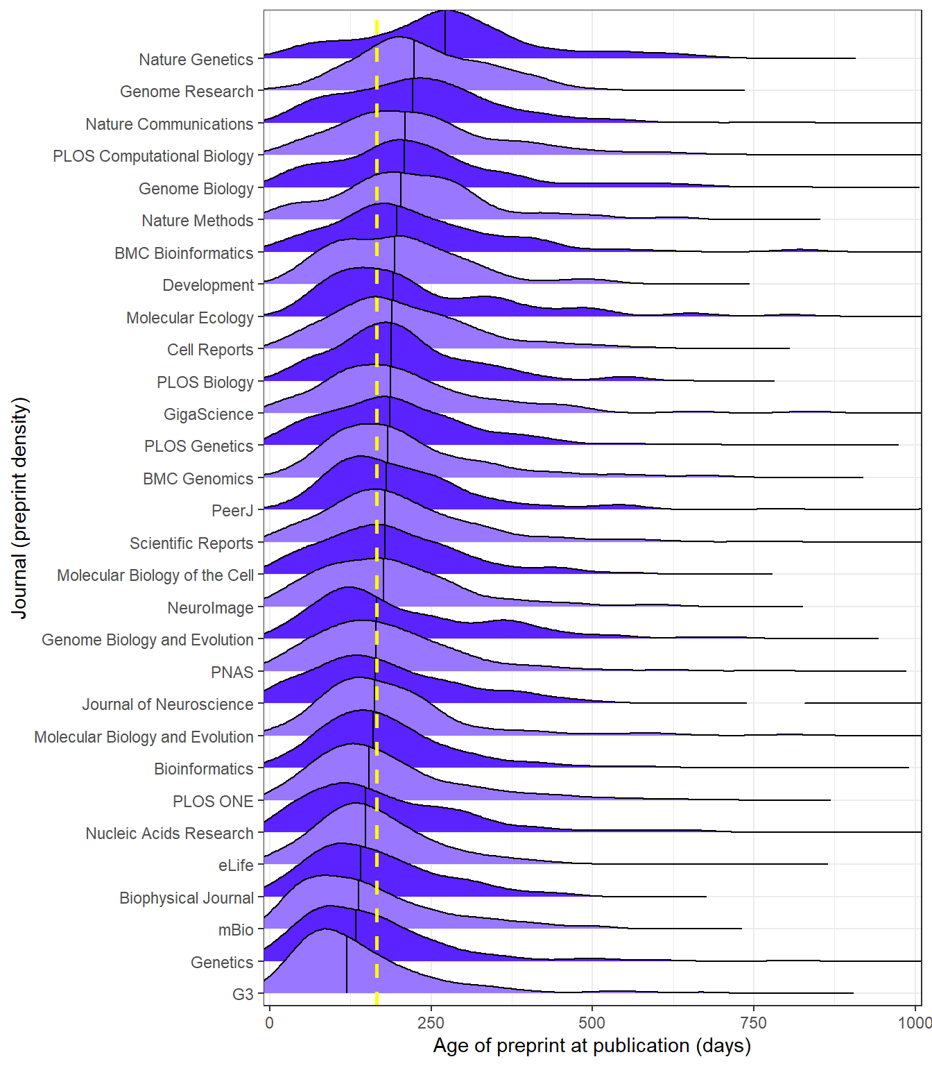
The chart we are set to recreate, originally obtained from Meta-Research: Tracking the popularity and outcomes of all bioRxiv preprints.
First, we import the data timeframe in R:
library(readxl)
timeframe <- read_excel(here("data", "timeframe.xlsx"))

str(timeframe)
tibble [7,653 × 3] (S3: tbl_df/tbl/data.frame)
$ id : num [1:7653] 2967 8845 16624 18517 24519 ...
$ interval: num [1:7653] 1312 1113 1051 1045 936 ...
$ journal : chr [1:7653] "PeerJ" "Nucleic Acids Research" "Journal of Neuroscience" "PeerJ" ...color1 = '#9977ff'
color2 = '#5a23ff'
ggplot(timeframe, aes(
x=interval,
y=reorder(journal, interval, FUN=median),
fill=reorder(journal, interval, FUN=median),
rel_min_height=0.000000000001
)) +
# Adding "stat = 'density' means the bandwidth (i.e. bin size)
# is calculated separately for each journal, rather than for the
# dataset as a whole
stat_density_ridges(
scale = 2,
quantile_lines = TRUE,
quantiles = 2
) +
scale_fill_cyclical(values=c(color1, color2)) +
scale_y_discrete(expand = c(0.01, 0.1)) +
scale_x_continuous(
expand = c(0.01, 0),
breaks=seq(0, 1000, 250),
) +
coord_cartesian(xlim=c(0,1000)) +
labs(x='Age of preprint at publication (days)', y='Journal (preprint density)') +
geom_vline(
xintercept=166,
col="yellow", linetype="dashed", linewidth=1
) +
theme_ridges() +
theme_bw()Picking joint bandwidth of 32.5