Dot plot

The original graph obtained from Office for National Statistics analysis using Longitudinal Education Outcomes (LEO) from the Department for Education (DfE)
library(ggdist)

library(tidyverse)      # Data Wrangling and Plotting
library(here)           # Files location and loading
# Option 1: tidytuesdayR package 

#tuesdata <- tidytuesdayR::tt_load('2024-01-23')
english_education <- readr::read_csv('https://raw.githubusercontent.com/rfordatascience/tidytuesday/master/data/2024/2024-01-23/english_education.csv')
#english_education <- tuesdata$english_education


# Define Text Size
ts = unit(20, units = "cm")   
city_levels <- c("Small Towns", "Medium Towns", "Large Towns", "Cities", "London")


df <- english_education |> 
  # Add populations of Inner and Outer London
  mutate(
    population_2011 = case_when(
      town11nm == "Outer london BUAs" ~ 4942040,
      town11nm == "Inner London BUAs" ~ 3231901,
      .default = population_2011
    )
  ) |> 
  mutate(
    size_flag = case_when(
      size_flag == "City" ~ "Cities",
      size_flag %in% c("Inner London BUA", "Outer london BUA") ~ "London",
      .default = size_flag
    )
  ) |> 
  filter(
    size_flag %in% city_levels
  ) |> 
  mutate(
    size_flag = factor(size_flag, levels = city_levels, labels = c("Small towns", "Medium towns", "Large towns", "City (excluding London)", "London")),
    size_flag = fct_rev(size_flag)
  )

# mean educational attainment scores
df1 <- df |> 
  group_by(size_flag) |> 
  summarise(
    mean_ed_score = mean(education_score, na.rm = T)
  ) |> 
  filter(size_flag!="London") |> 
  add_column(y = c(1.6, 2.6, 3.6, 4.6), yend = c(2.4, 3.4, 4.4, 5.4))
  

# Overall weighted mean Educational Attainment Score for UK
uk_mean <- df |> 
  summarize(
    uk_mean = mean(education_score)
  ) |> 
  as_vector() |> 
  unname()

# Adding names of cities for labels
label_cities <- c("Outer London", "Inner London")
df_match <- tibble(town_name = label_cities)

df2 <- df |> 
  mutate(
    town_name = str_remove_all(town11nm, " BUA"),
    town_name = str_remove_all(town_name, "SD"),
    town_name = case_when(
      town_name == "Inner Londons" ~ "Inner London",
      town_name == "Outer londons" ~ "Outer London"
    )
  ) |>
  filter(town_name %in% label_cities)
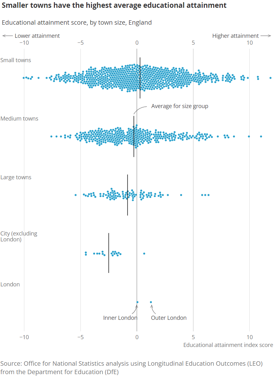
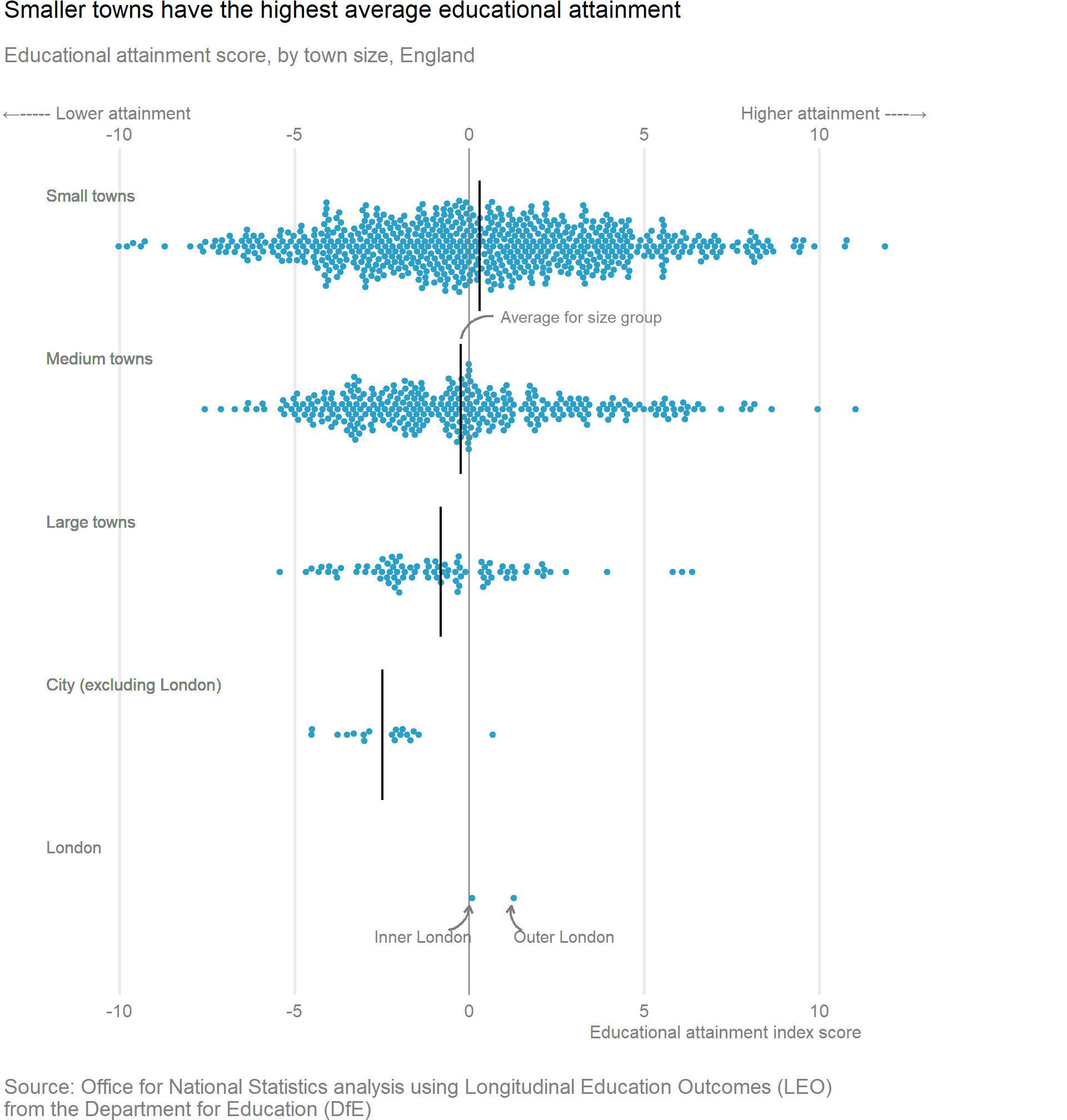
ggplot(data = df, aes(x = education_score, y = size_flag), ) +
  geom_dots(smooth = smooth_discrete(kernel = "epanechnikov"), 
            stackratio = 0.8, side = "both", layout = "swarm",
            slab_shape = 21,  slab_color = "#27A0CC", slab_fill = "#27A0CC", scale = 0.65, binwidth = unit(c(1.6, Inf), "mm")) +
  geom_text(aes(x = -12.1, y = size_flag, label = size_flag), color = "grey50", 
            size= 4.0, vjust = -3.5, hjust = 0) + 
  geom_vline(xintercept = 0, linetype = 1, color = "grey50") +
  geom_text(data = df2, color = "grey50", vjust = + 3.5,
            mapping = aes(x = education_score, y = size_flag,
                          label = town_name, hjust = case_when(town_name == "Outer London" ~ 0, 
                                                               town_name %in% c("Inner London") ~ 1,
                                                                           .default = 0.5)),
            vjust = 1.7, size = 0.2 * ts) +
  scale_x_continuous(
    minor_breaks = (-10:10), sec.axis = sec_axis(~., name = "Educational attainment index score"), position = "top"
  ) +
  labs(title = "Smaller towns have the highest average educational attainment",
       subtitle = "Educational attainment score, by town size, England",
       x = paste0("←----- Lower attainment", strrep(" ", 55),  strrep(" ", 55), "Higher attainment ----→"),
       caption = "Source: Office for National Statistics analysis using Longitudinal Education Outcomes (LEO)\nfrom the Department for Education (DfE)") +
   annotate(
    geom = "curve",
    x = -0.6,
    xend = uk_mean,
    y = 0.8,
    yend = 0.95,
    arrow = arrow(length = unit(2, "mm")),
    curvature = 0.35,
    color = "grey50",
    linewidth = 0.8
  ) +
     annotate(
    geom = "curve",
    x = 1.5,
    xend = 1.2,
    y = 0.8,
    yend = 0.95,
    arrow = arrow(length = unit(2, "mm")),
    curvature = - 0.35,
    color = "grey50",
    linewidth = 0.8
  ) +
  annotate("segment", x = df1$mean_ed_score, xend = df1$mean_ed_score, y = df1$y, yend = df1$yend, linewidth = 0.8) +
  annotate("text", x = 3.2, y = 4.57, label = "Average for size group", color = "grey50") +
    annotate(
    geom = "curve",
    x = uk_mean + 0.7,
    xend = df1$mean_ed_score[3],
    y = 4.57,
    yend = 4.43,
    curvature = 0.4,
    color = "grey50",
    linewidth = 0.8
  ) +
  theme_minimal(base_size = 12) +
  theme(plot.margin = margin(0, 95, 0, 0),
        plot.title = element_text(size = 16),
        plot.subtitle = element_text(size = 14, color = "grey50", margin = margin(t = 10, b = 25)),
        plot.caption = element_text(size = 14, color = "grey50", hjust = 0, margin = margin(t = 25)),
        axis.title = element_text(color = "grey50"),
        axis.title.x = element_text(size = 12, hjust = 0.9),
        axis.text = element_text(size = 12, color = "grey50"),
        panel.grid.minor = element_blank(),
        panel.grid.major.y = element_blank(),
        panel.grid.major.x = element_line(linewidth = 1),
    axis.text.y = element_blank(),
    axis.title.y = element_blank())

Back to top