# load packages
library(ggnewscale)
library(tidyverse)Radial bar chart
The chart we are set to recreate, originally obtained from 1 dataset 100 visualizations website created by Ferdio.
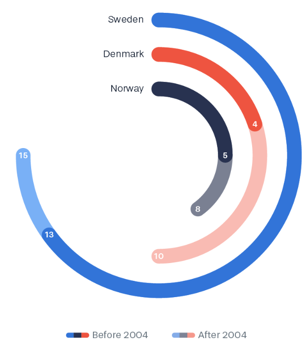
ORIGINAL CHART: #79 stacked radial bar chart
A radial bar chart is essentially a bar chart plotted on a polar coordinates system, rather than on a Cartesian one. In our case, the data visualization is a stacked radial bar chart where categories are stacked on top of each other within each radial segment.
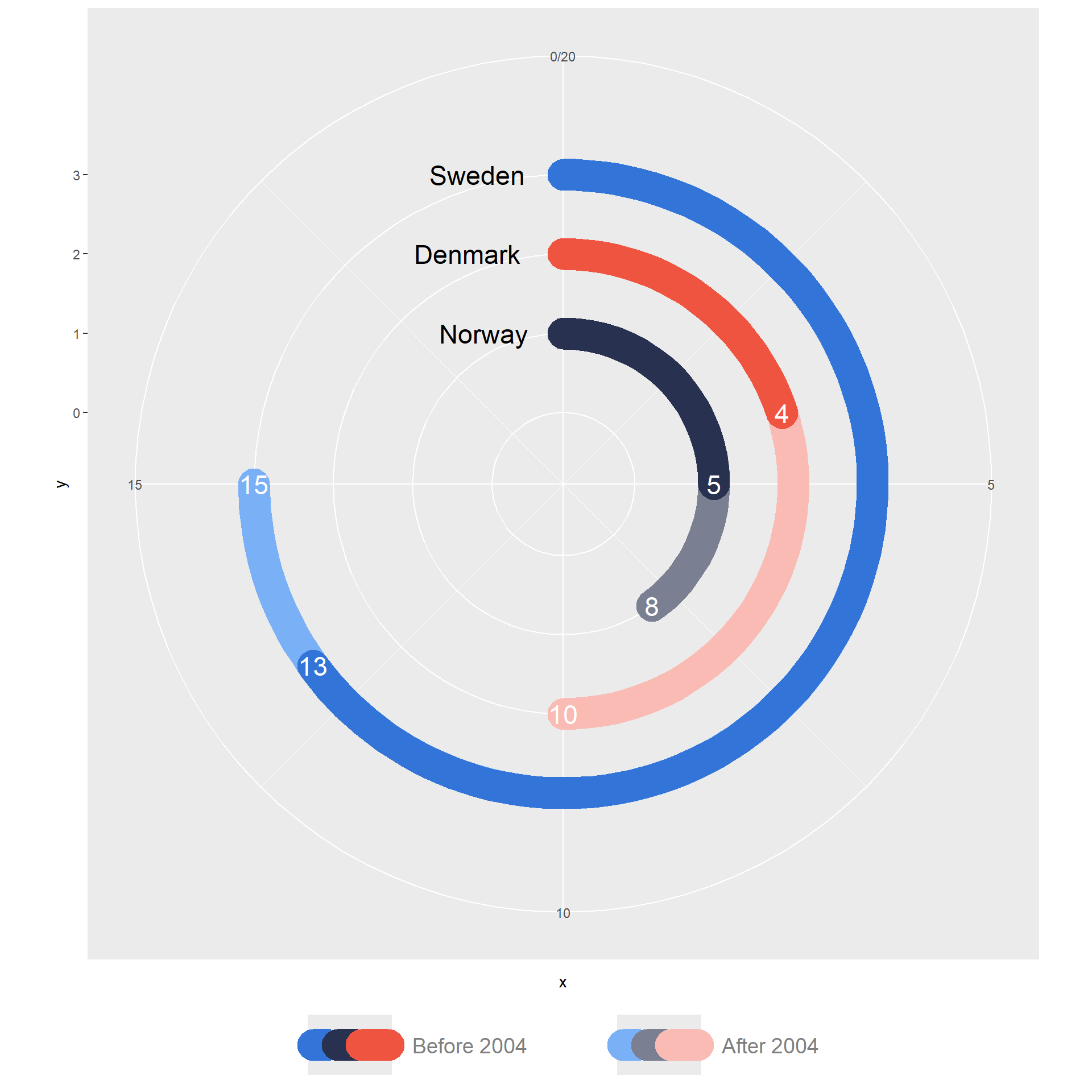
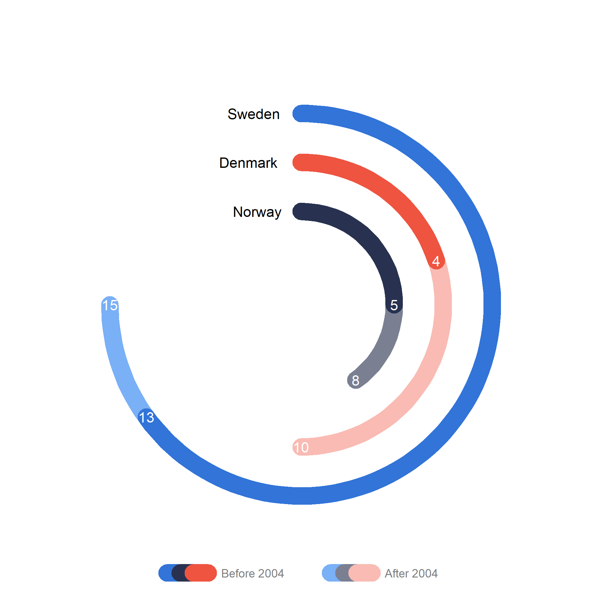
STORY: UNESCO heritage sites of Scandinavian countries
The #79 data visualization on Ferdio’s website is generated from a single dataset detailing the numbers of  UNESCO World Heritage Sites in Scandinavian countries (Sweden, Denmark, and Norway) inscribed before and after 2004, extending up to 2022.
According to properties inscribed on the World Heritage List up to 2022:
Sweden
Denmark
Norway
GEOMETRIES
: STEP-BY-STEP CHART RECREATION
STEP 0: Packages and data preparation
First, we load the necessary packages.
Then we create a dataframe with four columns in R:
x: A numeric variable containing the numbers of UNESCO World Heritage Sites. We use these numbers to define the end of the segments on the x-axis.
y: A numeric variable containing the position of the segment on the y-axis.
country: A character variable containing country names.
group: A character variable containing “group1” and “group2” corresponding to “After 2004” and “Before 2004”, respectively.
We also create two color sets:
STEP 1: Create a bar chart with segments for “group1”
We create a simple horizontal bar graph for the “group1” (After 2004) using geom_segment():
df |>
ggplot() +
  geom_segment(data = filter(df, group == "group1"),
               aes(x = 0, xend = x, y = y, yend = y, color = country),
               linewidth = 10, lineend = 'round')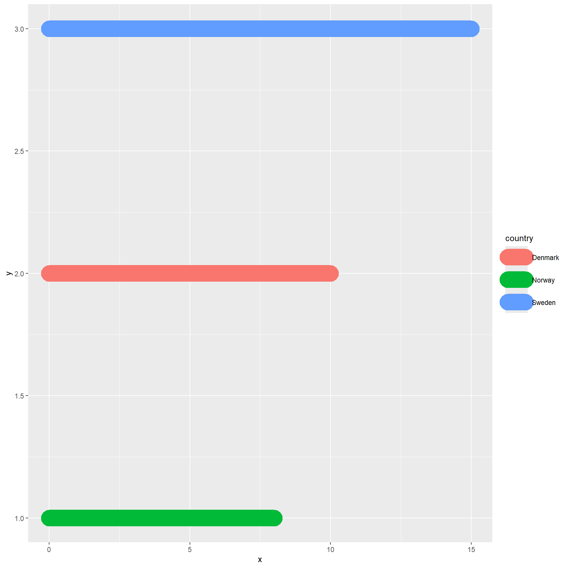
STEP 2: Add labels and set new colors
We add the numbers of UNESCO World Heritage Sites as labels at the end of the bars by incorporating a text-based geometry (geom_text) and we specify a custom color palette by applying the scale_color_manual scale function:
df |>
ggplot() +
  geom_segment(data = filter(df, group == "group1"),
               aes(x = 0, xend = x, y = y, yend = y, color = country),
               linewidth = 10, lineend = 'round') +
  geom_text(data = filter(df, group == "group1"),
            aes(x, y, label = x), color = "white", size = 6) +
  scale_color_manual(values = cols1)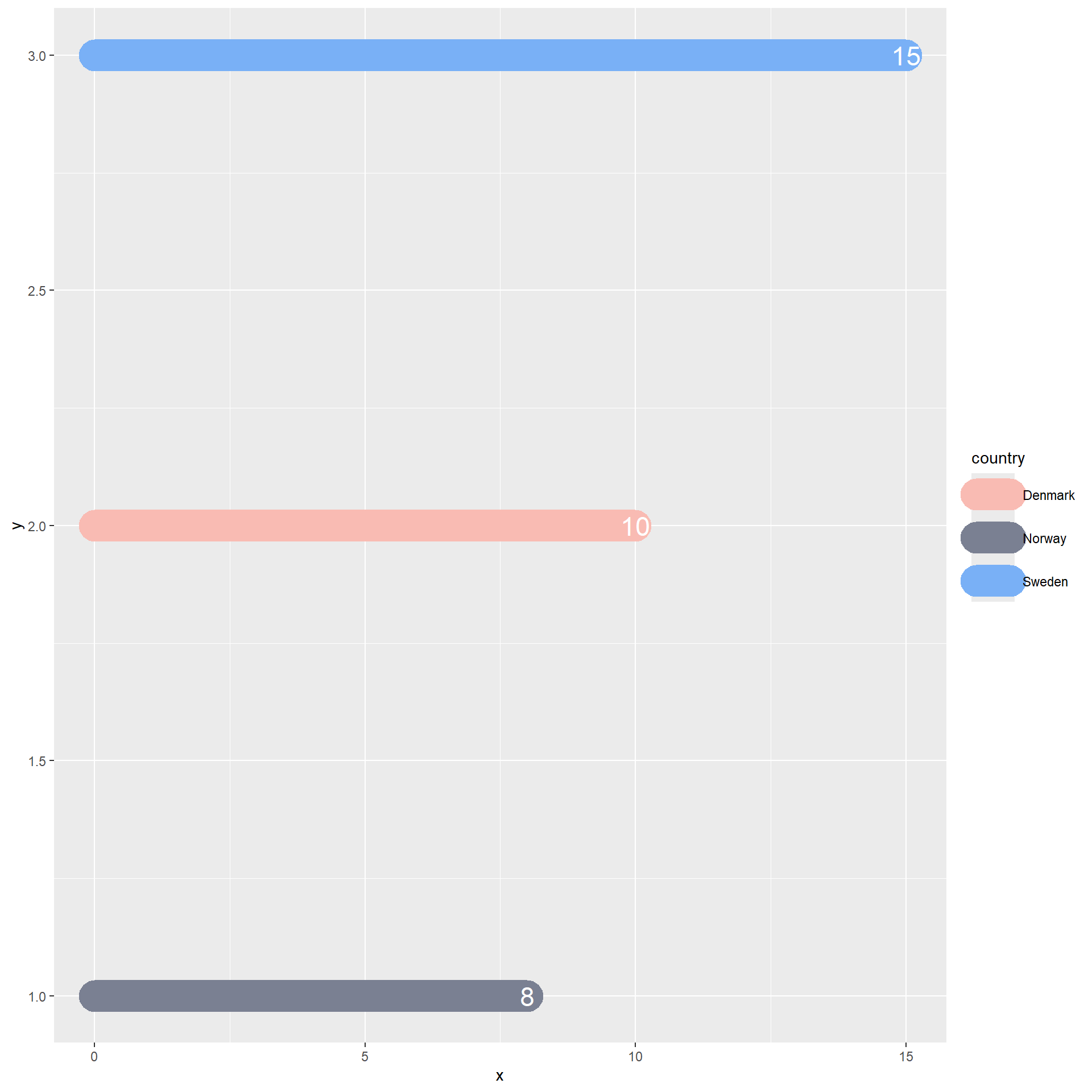
STEP 3: Add bars, labels and a second color scale for “group2”
df |>
ggplot() +
  geom_segment(data = filter(df, group == "group1"),
               aes(x = 0, xend = x, y = y, yend = y, color = country),
               linewidth = 10, lineend = 'round') +
  geom_text(data = filter(df, group == "group1"),
            aes(x, y, label = x), color = "white", size = 6) +
  scale_color_manual(values = cols1) +
  new_scale_color() +
  geom_segment(data = filter(df, group == "group2"),
               aes(x = 0, xend = x, y = y, yend = y, color = country),
               linewidth = 10, lineend = 'round') +
  geom_text(data = filter(df, group == "group2"),
            aes(x, y, label = x), color = "white", size = 6) +
scale_color_manual(values = cols2) 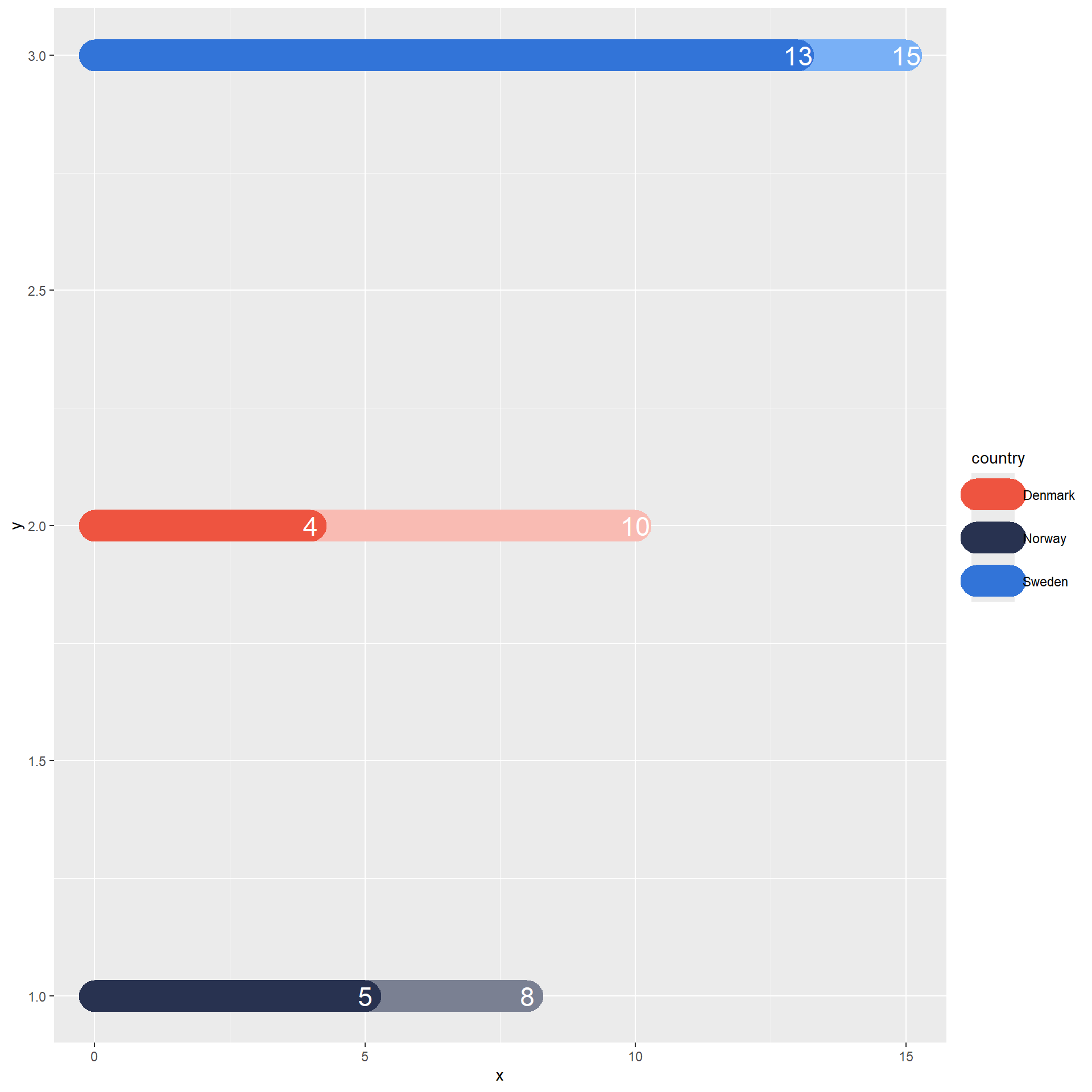
STEP 4: Set legend guides for each scale
df |>
ggplot() +
  geom_segment(data = filter(df, group == "group1"),
               aes(x = 0, xend = x, y = y, yend = y, color = country),
               linewidth = 10, lineend = 'round') +
  geom_text(data = filter(df, group == "group1"),
            aes(x, y, label = x), color = "white", size = 6) +
  scale_color_manual(values = cols1) +
  guides(color = guide_legend(title = "After 2004")) +
  new_scale_color() +
  geom_segment(data = filter(df, group == "group2"),
               aes(x = 0, xend = x, y = y, yend = y, color = country),
               linewidth = 10, lineend = 'round') +
  geom_text(data = filter(df, group == "group2"),
            aes(x, y, label = x), color = "white", size = 6) +
  scale_color_manual(values = cols2) +
  guides(color = guide_legend(title = "Before 2004"))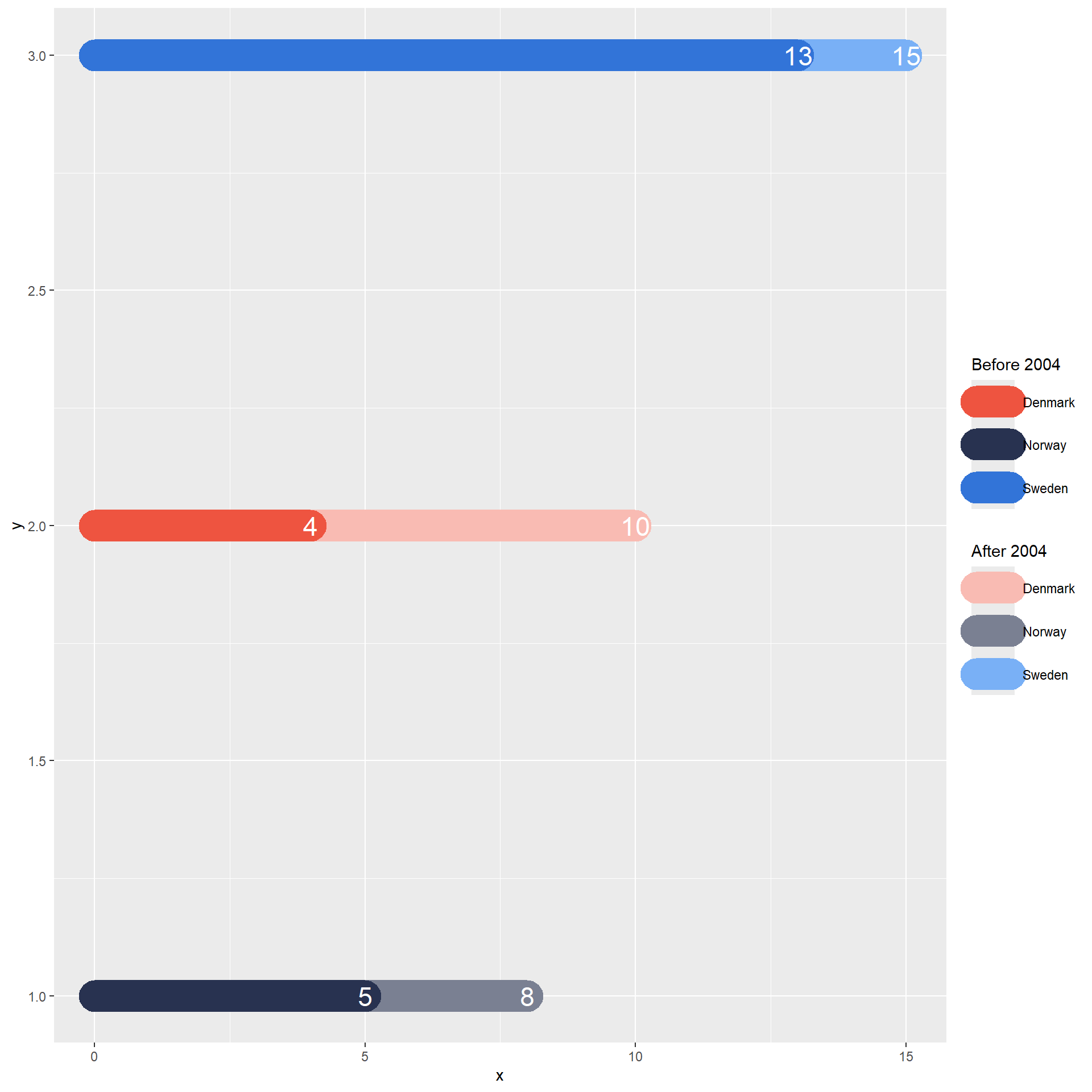
STEP 5: Switch to the polar coordinate system and change the legend position
df |>
ggplot() +
  geom_segment(data = filter(df, group == "group1"),
               aes(x = 0, xend = x, y = y, yend = y, color = country),
               linewidth = 10, lineend = 'round') +
  geom_text(data = filter(df, group == "group1"),
            aes(x, y, label = x), color = "white", size = 6) +
  scale_color_manual(values = cols1) +
  guides(color = guide_legend(title = "After 2004")) +
  new_scale_color() +
  geom_segment(data = filter(df, group == "group2"),
               aes(x = 0, xend = x, y = y, yend = y, color = country),
               linewidth = 10, lineend = 'round') +
  geom_text(data = filter(df, group == "group2"),
            aes(x, y, label = x), color = "white", size = 6) +
  scale_color_manual(values = cols2) +
  guides(color = guide_legend(title = "Before 2004")) +
  coord_polar() +
  theme(legend.position = "bottom")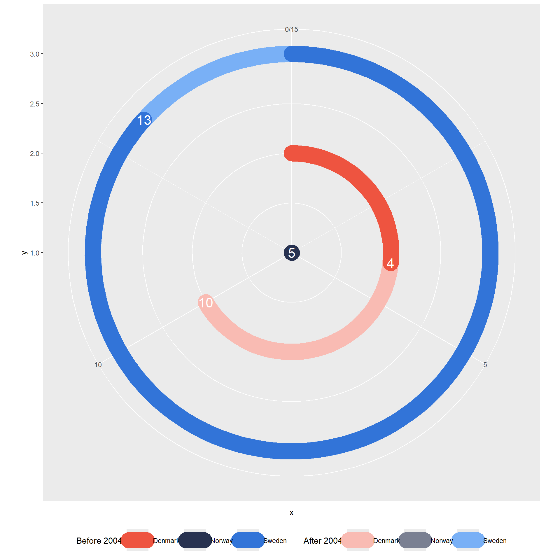
STEP 6: Adjust the limits of the axes
df |>
ggplot() +
  geom_segment(data = filter(df, group == "group1"),
               aes(x = 0, xend = x, y = y, yend = y, color = country),
               linewidth = 10, lineend = 'round') +
  geom_text(data = filter(df, group == "group1"),
            aes(x, y, label = x), color = "white", size = 6) +
  scale_color_manual(values = cols1) +
  guides(color = guide_legend(title = "After 2004")) +
  new_scale_color() +
  geom_segment(data = filter(df, group == "group2"),
               aes(x = 0, xend = x, y = y, yend = y, color = country),
               linewidth = 10, lineend = 'round') +
  geom_text(data = filter(df, group == "group2"),
            aes(x, y, label = x), color = "white", size = 6) +
  scale_color_manual(values = cols2) +
  scale_x_continuous(limits = c(0, 20)) +
  scale_y_continuous(expand = expansion(mult = 0.3), limits = c(0, 3)) +
  guides(color = guide_legend(title = "Before 2004")) +
  coord_polar() +
  theme(legend.position = "bottom")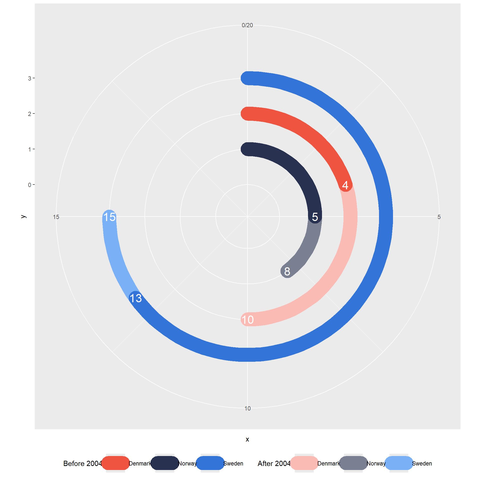
STEP 7: Add country labels
df |>
ggplot() +
  geom_segment(data = filter(df, group == "group1"),
               aes(x = 0, xend = x, y = y, yend = y, color = country),
               linewidth = 10, lineend = 'round') +
  geom_text(data = filter(df, group == "group1"),
            aes(x, y, label = x), color = "white", size = 6) +
  geom_text(data = filter(df, group == "group1"),
            aes(x = 0, y, label = country), size = 6, hjust = 1.4) +
  scale_color_manual(values = cols1) +
  guides(color = guide_legend(title = "After 2004")) +
  new_scale_color() +
  geom_segment(data = filter(df, group == "group2"),
               aes(x = 0, xend = x, y = y, yend = y, color = country),
               linewidth = 10, lineend = 'round') +
  geom_text(data = filter(df, group == "group2"),
            aes(x, y, label = x), color = "white", size = 6) +
  scale_color_manual(values = cols2) +
  scale_x_continuous(limits = c(0, 20)) +
  scale_y_continuous(expand = expansion(mult = 0.3), limits = c(0, 3)) +
  guides(color = guide_legend(title = "Before 2004")) +
  coord_polar() +
  theme(legend.position = "bottom")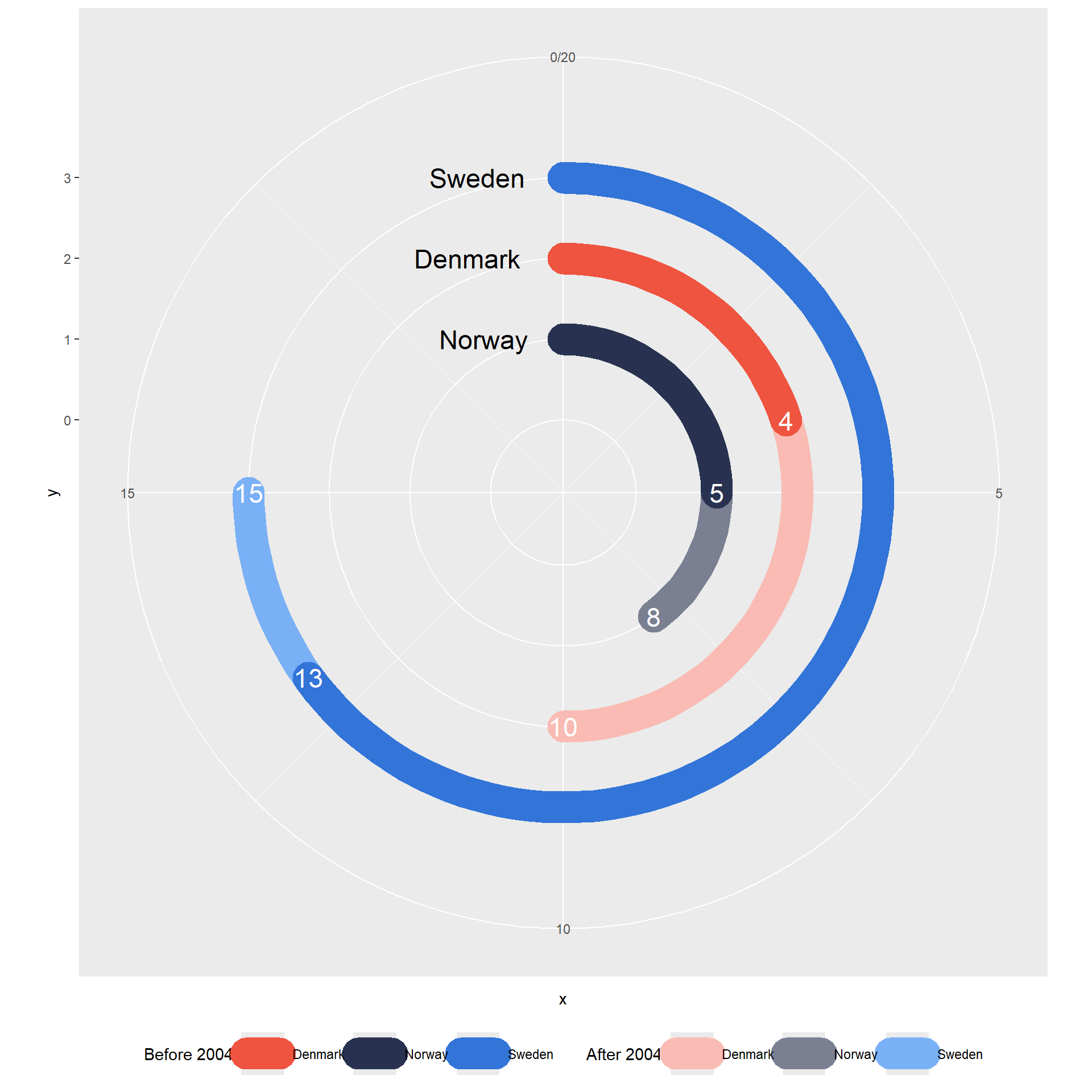
STEP 8: Fine-tune the chart’s legend
df |>
ggplot() +
  geom_segment(data = filter(df, group == "group1"),
               aes(x = 0, xend = x, y = y, yend = y, color = country),
               linewidth = 10, lineend = 'round') +
  geom_text(data = filter(df, group == "group1"),
            aes(x, y, label = x), color = "white", size = 6) +
  geom_text(data = filter(df, group == "group1"),
            aes(x = 0, y, label = country), size = 6, hjust = 1.4) +
  scale_color_manual(values = cols1) +
  guides(color = guide_legend(title = paste0(strrep(" ", 8), "After 2004"),
                              override.aes = list(size = c(3, 4, -2)),
                              reverse = TRUE,
                              keywidth = 1.5,
                              title.position = "right")) +
  new_scale_color() +
  geom_segment(data = filter(df, group == "group2"),
               aes(x = 0, xend = x, y = y, yend = y, color = country),
               linewidth = 10, lineend = 'round') +
  geom_text(data = filter(df, group == "group2"),
            aes(x, y, label = x), color = "white", size = 6) +
  scale_color_manual(values = cols2) +
  scale_x_continuous(limits = c(0, 20)) +
  scale_y_continuous(expand = expansion(mult = 0.3), limits = c(0, 3)) +
  guides(color = guide_legend(title = paste0(strrep(" ", 8), "Before 2004", strrep(" ", 10)),
                              reverse = TRUE, override.aes = list(size = c(3, 4, -2)),
                              keywidth = 1.5, order = 1,
                              title.position = "right")) +
  coord_polar() +
  theme(legend.position = "bottom",
        legend.title = element_text(size = 14, color = "gray50"),
        legend.text = element_text(margin = margin(r = -2, unit = 'cm'), color = NA)
  )
STEP 9: Apply final theme adjustments to the chart
df |>
  ggplot() +
  geom_segment(data = filter(df, group == "group1"),
               aes(x = 0, xend = x, y = y, yend = y, color = country),
               linewidth = 10, lineend = 'round') +
  geom_text(data = filter(df, group == "group1"),
            aes(x, y, label = x), color = "white", size = 6) +
  geom_text(data = filter(df, group == "group1"),
            aes(x = 0, y, label = country), size = 6, hjust = 1.4) +
  scale_color_manual(values = cols1) +
  guides(color = guide_legend(title = paste0(strrep(" ", 8), "After 2004"),
                              override.aes = list(size = c(3, 4, -2)),
                              reverse = TRUE,
                              keywidth = 1.0,
                              title.position = "right")) +
  new_scale_color() +
  geom_segment(data = filter(df, group == "group2"),
               aes(x = 0, xend = x, y = y, yend = y, color = country),
               linewidth = 10, lineend = 'round') +
  geom_text(data = filter(df, group == "group2"),
            aes(x, y, label = x), color = "white", size = 6) +
  scale_color_manual(values = cols2) +
  scale_x_continuous(limits = c(0, 20)) +
  scale_y_continuous(expand = expansion(mult = 0.3), limits = c(0, 3)) +
  guides(color = guide_legend(title = paste0(strrep(" ", 8), "Before 2004", strrep(" ", 10)),
                              reverse = TRUE, override.aes = list(size = c(3, 4, -2)),
                              keywidth = 1.0, order = 1,
                              title.position = "right")) +
  coord_polar() +
  theme(panel.background = element_blank(),
        axis.title = element_blank(),
        axis.text = element_blank(),
        axis.ticks = element_blank(),
        legend.position = "bottom",
        legend.title = element_text(size = 14, color = "gray50"),
        legend.text = element_text(margin = margin(r = -2, unit = 'cm'), color = NA),
        legend.margin = margin(t = -65),
        legend.spacing.x = unit(0.5, "cm"),
        legend.key = element_rect(color = NA, fill = NA)
  )
Storytelling with the chart
In general, the numbers of world heritage sites in Scandinavian countries have increased between 2004 and 2022. Sweden maintained its status as the country with the highest number of UNESCO World Heritage Sites throughout the period, underscoring its rich cultural and natural heritage. However, Denmark emerged as the front runner in terms of acquiring new designations, surpassing both Sweden and Norway in this aspect. Remarkably, Denmark saw a surge in the addition of UNESCO sites, particularly after 2004, contrasting with Sweden and Norway, which garnered most of their designations prior to that year.