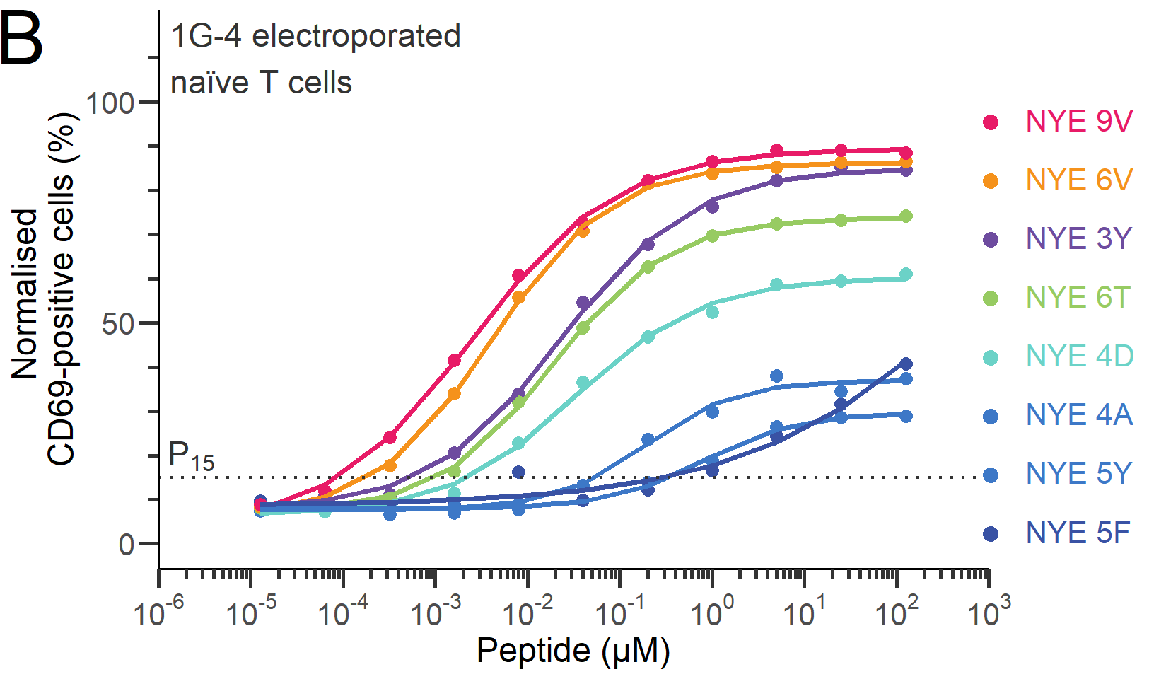
Dose-response curves
The chart we are set to recreate, originally obtained from the article “The discriminatory power of the T cell receptor” (doi: 10.7554/eLife.67092) published in eLife, stands as a prime example of a dose-response curves chart.
ORIGINAL CHART: Example dose-responses for naïve T cells.
A dose-response curves chart is a graphical representation used in various scientific fields, including pharmacology, toxicology, and environmental science, to illustrate the association between the dose of a substance and the response it elicits in a biological system. The x-axis typically represents the dose or concentration of the substance administered, while the y-axis represents the magnitude of the response.
We need to load the following packages:
We load the file drc.xlsx in R.
library(readxl)
drc <- read_excel("data/drc.xlsx")

head(drc)
# A tibble: 6 × 49
dose NYE9V1 NYE6V1 NYE3Y1 NYE6T1 NYE4D1 NYE4A1 NYE5Y1 NYE5F1 NYE9V2 NYE6V2
<dbl> <dbl> <dbl> <dbl> <dbl> <dbl> <dbl> <dbl> <dbl> <dbl> <dbl>
1 125 95 95.6 92 95.5 89.5 55.3 89.6 91.3 83.9 78.5
2 25 96.9 96.3 95.3 94.8 91.5 65.5 85.1 81.5 86.4 79.8
3 5 96.9 97 95.2 95.8 92.1 50 89.8 74.4 86.7 83.2
4 1 97.7 95.9 94.8 95.3 91 46.9 86 53.9 82.2 84.7
5 0.2 96.7 96.4 95 94.2 89 41.3 74.8 41.4 84.4 80.9
6 0.04 97.4 94.9 92.5 91.9 85.7 35.7 44.7 36.0 70.1 67.3
# ℹ 38 more variables: NYE3Y2 <dbl>, NYE6T2 <dbl>, NYE4D2 <dbl>, NYE4A2 <dbl>,
# NYE5Y2 <dbl>, NYE5F2 <dbl>, NYE9V3 <dbl>, NYE6V3 <dbl>, NYE3Y3 <dbl>,
# NYE6T3 <dbl>, NYE4D3 <dbl>, NYE4A3 <dbl>, NYE5Y3 <dbl>, NYE5F3 <dbl>,
# NYE9V4 <dbl>, NYE6V4 <dbl>, NYE3Y4 <dbl>, NYE6T4 <dbl>, NYE4D4 <dbl>,
# NYE4A4 <dbl>, NYE5Y4 <dbl>, NYE5F4 <dbl>, NYE9V5 <dbl>, NYE6V5 <dbl>,
# NYE3Y5 <dbl>, NYE6T5 <dbl>, NYE4D5 <dbl>, NYE4A5 <dbl>, NYE5Y5 <dbl>,
# NYE5F5 <dbl>, NYE9V6 <dbl>, NYE6V6 <dbl>, NYE3Y6 <dbl>, NYE6T6 <dbl>, …We have eight peptides labeled as “NYE9V”, “NYE6V”, “NYE3Y”, “NYE6T”, “NYE4D”, “NYE4A”, “NYE5Y”, and “NYE5F”, each with six replicates denoted from 1 to 6 (e.g., NYE9V1, NYE9V2, NYE9V3, etc.). The data values for these peptides appear to be within the range of 0 to 100. To represent the data, we will calculate the mean value for each dose per peptide.
drc_tidy <- drc |>
  pivot_longer(cols = -dose,
               names_to = "sample",
               values_to = "response") |>
  mutate(
    peptides = str_sub(sample, 1, 5),
    replicate = str_sub(sample, 6, 6)
  )


drc_per_peptide <- drc_tidy |>
  group_by(dose, peptides) |>
  summarize(
    #sem = sd(response)/sqrt(n()),
            response = mean(response)
            )


model <- drm(data = drc_tidy,
             formula = response ~ dose,
             curveid = peptides,
             fct = LL.4(names = c("Hill slope", "Min", "Max", "EC50")))


predicted_data <- data.frame(
  dose = rep(drc$dose, times = 8),
  peptides = rep(c("NYE9V", "NYE6V", "NYE3Y", "NYE6T",
                    "NYE4D", "NYE4A", "NYE5Y", "NYE5F"),
                  each = nrow(drc))

)

predicted_data$prediction <- predict(model, newdata = predicted_data)


drc_per_peptide <- drc_per_peptide |>
  mutate(peptides = factor(peptides, levels =  c("NYE9V", "NYE6V", "NYE3Y",
                                                   "NYE6T", "NYE4D", "NYE4A",
                                                   "NYE5Y", "NYE5F"),
                            labels =  c("NYE 9V", "NYE 6V", "NYE 3Y",
                                        "NYE 6T", "NYE 4D", "NYE 4A",
                                        "NYE 5Y", "NYE 5F"))
         )


predicted_data <- predicted_data |>
  mutate(peptides = factor(peptides, levels =  c("NYE9V", "NYE6V", "NYE3Y",
                                                   "NYE6T", "NYE4D", "NYE4A",
                                                   "NYE5Y", "NYE5F"),
                            labels =  c("NYE 9V", "NYE 6V", "NYE 3Y",
                                        "NYE 6T", "NYE 4D", "NYE 4A",
                                        "NYE 5Y", "NYE 5F"))
         )
We also set particular colors for the selected countries:
# Colors

my_colors <- c("#E81B67", "#F5921C", "#6E4C9F", "#97CB62",
               "#6BD2C7", "#3D78C7", "#3D78c7", "#3952A4", "#2B267C")
drc_per_peptide |>
ggplot(aes(x = log10(dose), y = response, color = peptides)) +
geom_point(size = 3) +
geom_line(data = predicted_data, linewidth = 1.3, show.legend = FALSE,
aes(x = log10(dose), y = prediction)) +
geom_hline(yintercept = 15, col="grey20", linetype="dotted", linewidth = 0.8
) +
scale_y_continuous(
limits = c(0, 115),
breaks = seq(0, 100, 50),
minor_breaks = seq(0, 115, 10)
) +
scale_x_continuous(
limits = c(-6, 3),
breaks = -6:3,
expand = c(0,0),
minor_breaks = log10(rep(1:9, 7)*(10^rep(-10:3, each = 9))),
labels = function(lab) {
do.call(
expression,
lapply(paste(lab), function(x) bquote("10"^.(x)))
)
}
) +
guides(x = guide_axis(minor.ticks = TRUE),
y = guide_axis(minor.ticks = TRUE),
color = guide_legend(override.aes = list(size = 3.5))
) +
scale_color_manual(
labels = paste("<span style='color:",
my_colors,
"'>",
levels(drc_per_peptide$peptides),
"</span>"),
values = my_colors) +
annotate("text", x = log(10^-2.45), y = 20, size = 6,
label = expression("P"["15"]), color = "grey20") +
annotate("text", x = log(10^-2.55), y = 110, hjust = 0, size = 6,
label = "1G-4 electroporated \nnaïve T cells", color = "grey20") +
labs(x = "Peptide (μΜ)", y = "Normalised \nCD69-positive cells (%)",
tag = "B") +
theme(panel.background = element_blank(),
axis.title = element_text(size = 18),
axis.text = element_text(size = 16),
axis.line = element_line(color="black", linewidth = 0.7),
axis.ticks.length = unit(10, "pt"),
axis.minor.ticks.length = rel(0.5),
axis.ticks = element_line(size = 0.9),
legend.title = element_blank(),
legend.text = element_markdown(size = 16),
legend.key.size = unit(1.1, "cm"),
legend.key.width = unit(0.9,"cm"),
legend.margin = margin(l = -0.8, b = -1.45, unit = "cm"),
plot.tag = element_text(size = 40),
plot.tag.position = c(0.01, 0.96)
)